Help Support Our Growing Community
DOTAFire is a community that lives to help every Dota 2 player take their game to the next level by having open access to all our tools and resources. Please consider supporting us by whitelisting us in your ad blocker!

Want to support DOTAFire with an ad-free experience? You can support us ad-free for less than $1 a month!

Go Ad-Free
Smitefire logo

Join the leading DOTA 2 community.
Create and share Hero Guides and Builds.

Create an MFN Account


Or

Hero Guides Layout Update!

Please review our General Rules & Guidelines before posting or commenting anywhere on DOTAFire.

Forum » News » Hero Guides Layout Update! 8 posts - page 1 of 1
Permalink | Quote | PM | +Rep by Hades4u » May 4, 2015 8:41pm | Report
The best guides deserve the best looks!

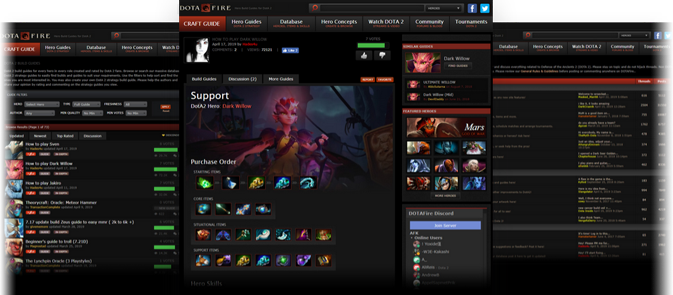
We've updated our hero guide layout to be more clean and clear. Now it should be more obvious which hero the guide is for in case of mis-clicks or mis-read guide titles, with the added perk of looking totally awesome.


The voting display received some updates as well. The vote buttons are now much larger and easier to find, and the highlight is more obvious if you've already voted on them.


We've also cleaned up the score display while browsing guides and on the guides themselves (the score displayed is the ranked score). In addition, the "New Guide" indication is more visually distinct from the score display to be more clear it isn't just an empty bar.


We hope you enjoy these updates, and always remember any feedback is welcome. We'd love to hear your opinion! :)
Message me if you'd like to join our official Discord server!

Hades4u
<Community Lead>

Awards Showcase
Show more awards

Distinguished (296)
Posts: 4700
Steam: hades4you
Permalink | Quote | PM | +Rep by Krwiozerca » May 4, 2015 9:56pm | Report
Loving it. I was waiting for the official post regarding this change.

Krwiozerca

Awards Showcase
Show more awards

Remarkable (34)
Posts: 811
Steam: Krwiozerca
View My Blog
Permalink | Quote | PM | +Rep by Cuttleboss » May 4, 2015 10:41pm | Report
I noticed this due to guide progress lately.

Although not every hero has an illustration yet.

Cuttleboss
<Editor>


Remarkable (28)
Posts: 689
Permalink | Quote | PM | +Rep by Hades4u » May 5, 2015 8:53pm | Report
Cuttleboss wrote:

I noticed this due to guide progress lately.

Although not every hero has an illustration yet.

Indeed, not every hero has one because I couldn't really find official art for them. I cannot use fan artwork because of copyright issues.
Message me if you'd like to join our official Discord server!

Hades4u
<Community Lead>

Awards Showcase
Show more awards

Distinguished (296)
Posts: 4700
Steam: hades4you
Permalink | Quote | PM | +Rep by apaz » May 5, 2015 9:28pm | Report
It kind of just messed with me when I first saw it, bit I think that it could be a welcome change. It is growing on me. The bars and pictures are awesome.

I think though, that the entire site should be consistent on the graphic style that it uses. I would actually suggest either a slightly lighter shade of background or a slightly darker shade of white in the new bright white font. That may fix it. I can take a screenshot and retouch it to have that slightly darker text and get back to you.


Of course, my opinion doesn't matter. The opinion of you, the other mods, and the general community are the ones that count. And so, It isn't ermagherd, pls fix, it is more of just drawing attention to a potential problem. I don't intend to be bossy or stepping out of line, although it may seem like it.


My newest guide:

Picking up Skywrath


apaz


Notable (17)
Posts: 356
Steam: apaz
View My Blog
Permalink | Quote | PM | +Rep by Mowen » May 5, 2015 10:34pm | Report
@apaz - That's totally fine! If you could link us to 2 pages / provide 2 screenshots of where you feel the text style is not consistent we'll check 'em out. :)

Mowen
<Production Coordinator>


Notable (17)
Posts: 365
Steam: Mowen
View My Blog
Permalink | Quote | PM | +Rep by Blubbles » May 6, 2015 2:47am | Report
I think that the site would look more clean and modern and cool overlal if you removed the gradients. I really like that look, looks very crisp and new. Google and Apple have removed the gradients from thie apps and things like in iOS 7. Just a suggestion.
Mood of the Day


^_^

Blubbles


Notable (13)
Posts: 933
Steam: Axolotl
View My Blog
Permalink | Quote | PM | +Rep by Dimonychan » May 6, 2015 1:40pm | Report
Hades4u wrote:


Indeed, not every hero has one because I couldn't really find official art for them. I cannot use fan artwork because of copyright issues.

Perhaps wiki can help. Many hero articles have an official image at the end of them that Valve have drawn upon hero release in Dota 2. You can just cut off the part you need, they all have enough resolution.

Dimonychan

Awards Showcase
Show more awards

Remarkable (43)
Posts: 1595
View My Blog

Quick Reply

Please log in or sign up to post!

DOTAFire is the place to find the perfect build guide to take your game to the next level. Learn how to play a new hero, or fine tune your favorite DotA hero’s build and strategy.

Copyright © 2019 DOTAFire | All Rights Reserved